

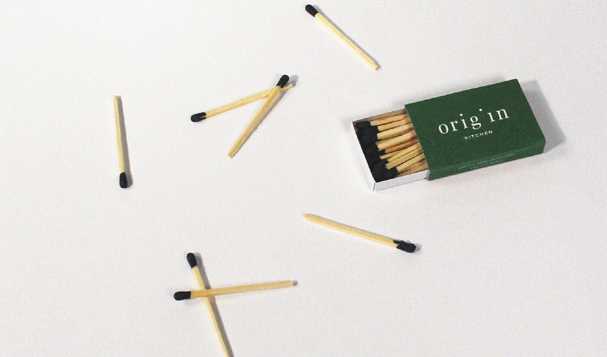
Origin Kitchen
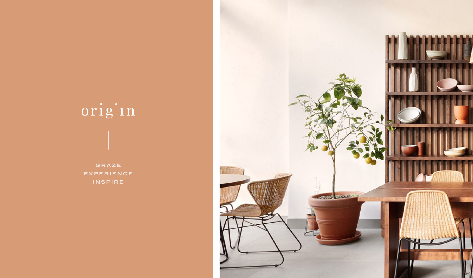
The clients brief was to create a brand identity that is incredibly relaxed with big emphasis on freshly prepared, sustainable and simple food all wrapped up in a neutral palette. After an initial phone call with Oli to kick start the project, i learnt more about his love for the simple things in life and how he wants to reflect this in his brand, business and restaurant.
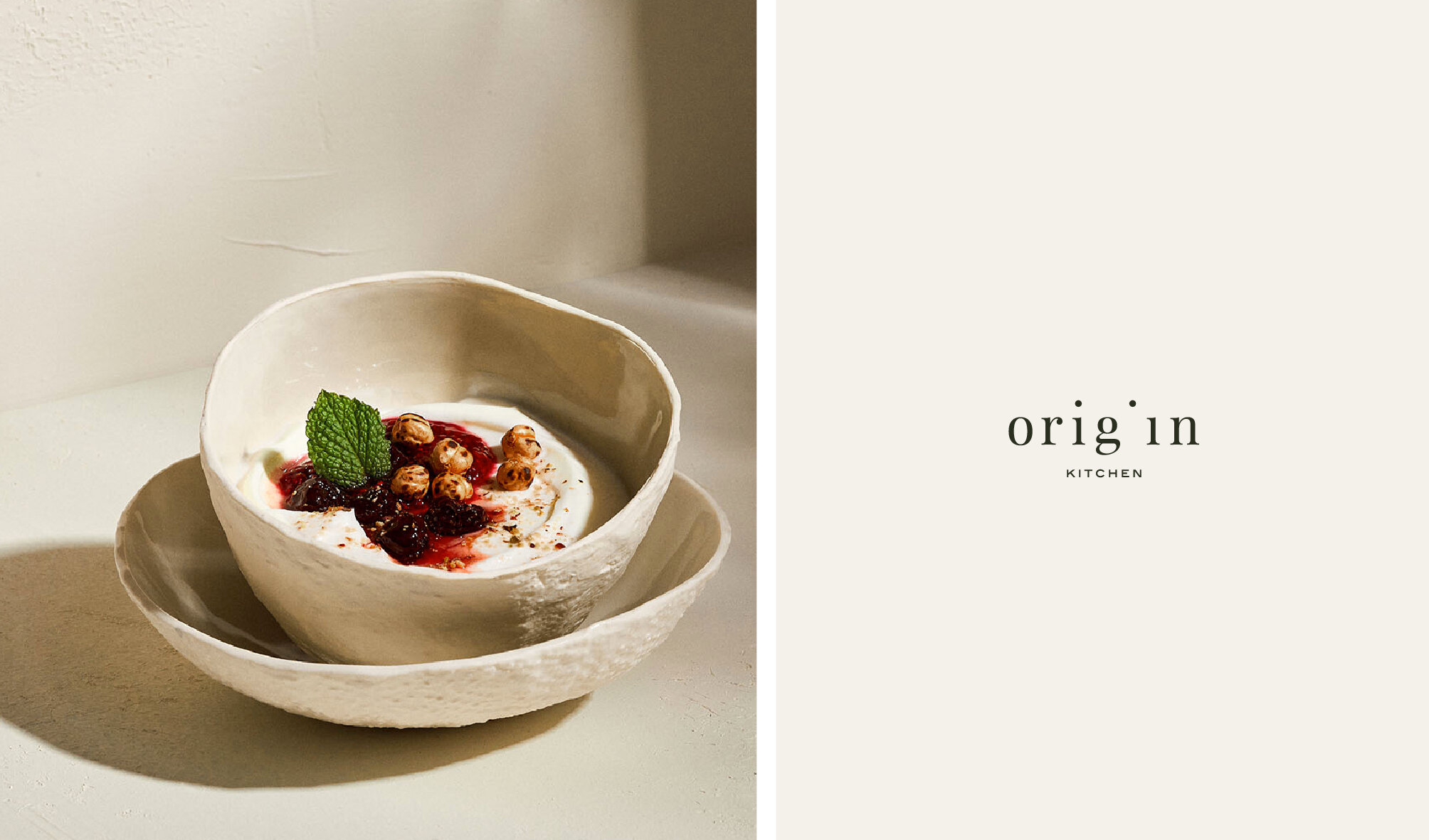
The main logo was created using a classic typeface to keep a timeless feel, adding a gap and off-setting the dot of the letter ‘i’ to add character. The matching submark was inspired by beautifully handmade ceramics and it’s organic shapes, keeping the centre strong and clean by using parts of the main logo for brand recognition.
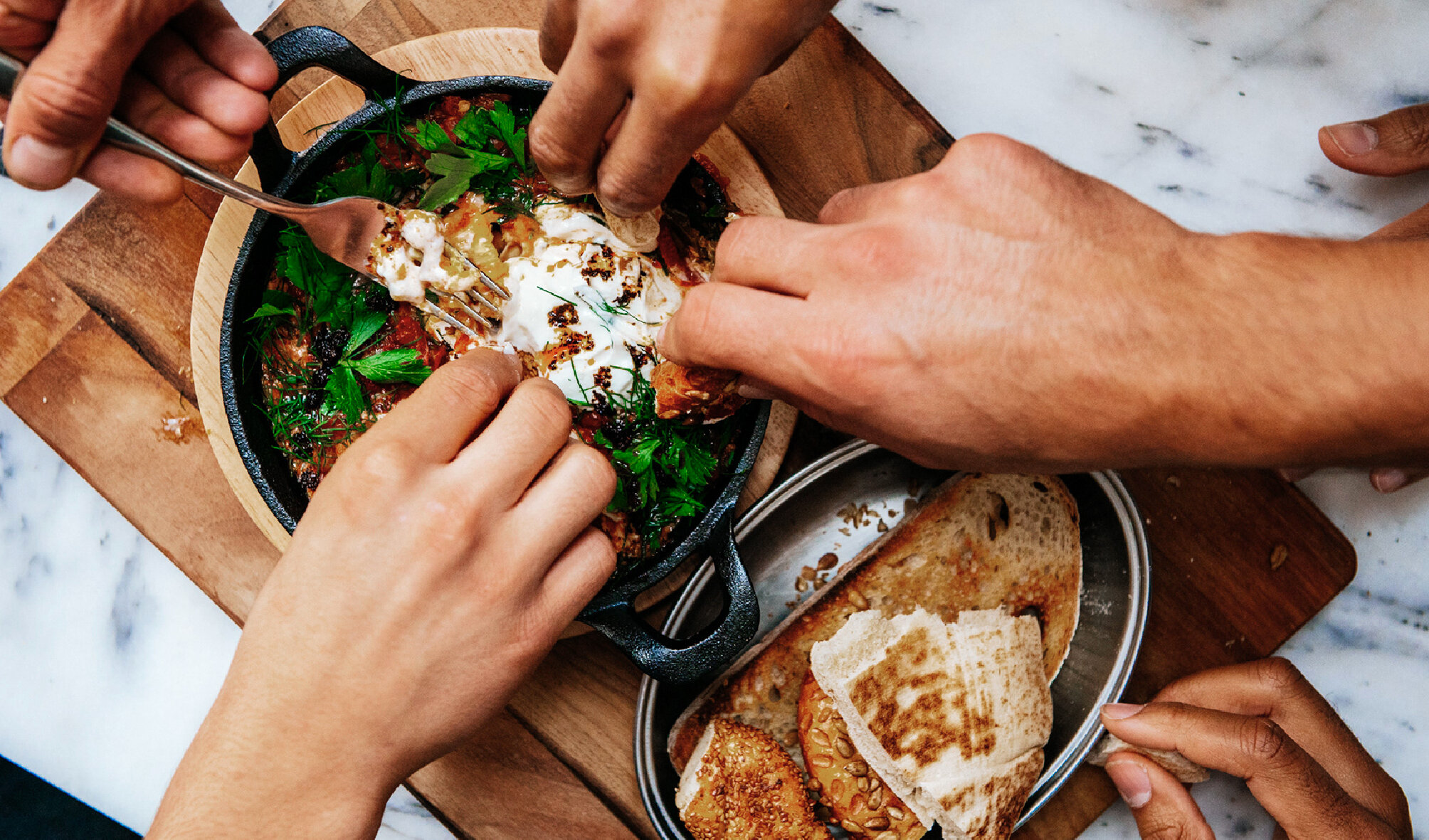
Services provided
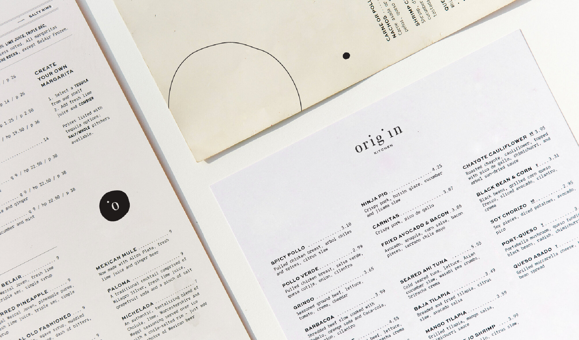
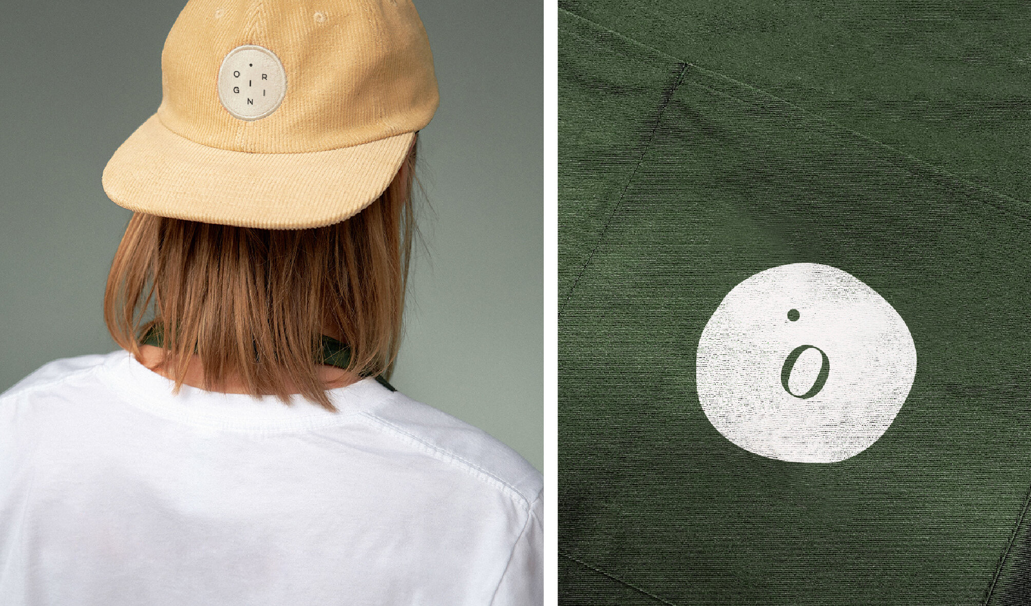
Brand Identity including typeface, colour concept, business cards, menu designs and merchandise mock ups.